Visualize

A tablet screen displaying a financial chart with two lines, one red and one cyan, representing data trends over time. The background is dark with text showing figures at the top, including maximum, minimum values, and a percentage.
A line graph with a green fluctuating line on a light background, indicating data trends over time. The labels 'Heute', 'Woche', 'Monat', and 'Jahr' suggest timeframes such as today, week, month, and year.
A laptop displays a global map visualization of COVID-19 cases, showing data from various countries. The left panel lists confirmed cases by country, with China having the highest count. The right panel displays the total number of deaths and recovered cases. Circles of varying sizes on the map indicate the concentration of cases in different regions.
A laptop displaying a line graph with various peaks and troughs on its screen, indicating stock or financial data. The graph and numbers are green against a black background. The laptop is placed on a wooden table, and beside it, a person's arm is partially visible.
The image displays a digital screen with COVID-19 statistics, including the numbers of recovered, deaths, and suspected cases. A map with blue circular markers is visible on the right side, indicating different locations.
A dark themed graphic displaying a horizontal bar chart with different colored bars. The chart is titled 'Sintomas Registados' with categories labeled as Febre, Tosse, Dores Musculares, Cefaleias, and others. Numbers are aligned next to the bars indicating specific values for each symptom.

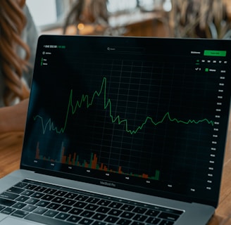
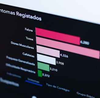
Transforming data into engaging visual stories.

FAQ Section

What topics does Geostatista cover?

Geostatista covers global maps, statistics, political analysis, country comparisons, and world rankings.

How is data presented?

Data is presented visually, making complex information easy to understand and accessible for all users.

Who can benefit from Geostatista?

Students, researchers, policymakers, and anyone curious about global trends can benefit from Geostatista's engaging visuals and data.

What is the mission?

Our mission is to make data accurate, visually appealing, and accessible for everyone.

Why choose Geostatista?

Choose Geostatista for clear visuals that tell powerful stories through data.

How often is content updated?

Content is regularly updated to reflect the latest trends and statistics across various topics.